A branding system for a curated second-hand lifestyle marketplace, bringing together vintage textures, earthy hues, and community-driven charm. Designed for online storefront and in-person pop-ups, the brand needed to feel warm, stylish, and accessible while embracing an eclectic aesthetic rooted
in thrift-culture sensibility.
Concept Inspiration
Design Strategy
Brand Board

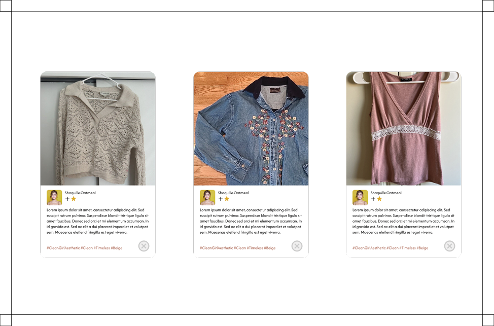
Who's out shopping?
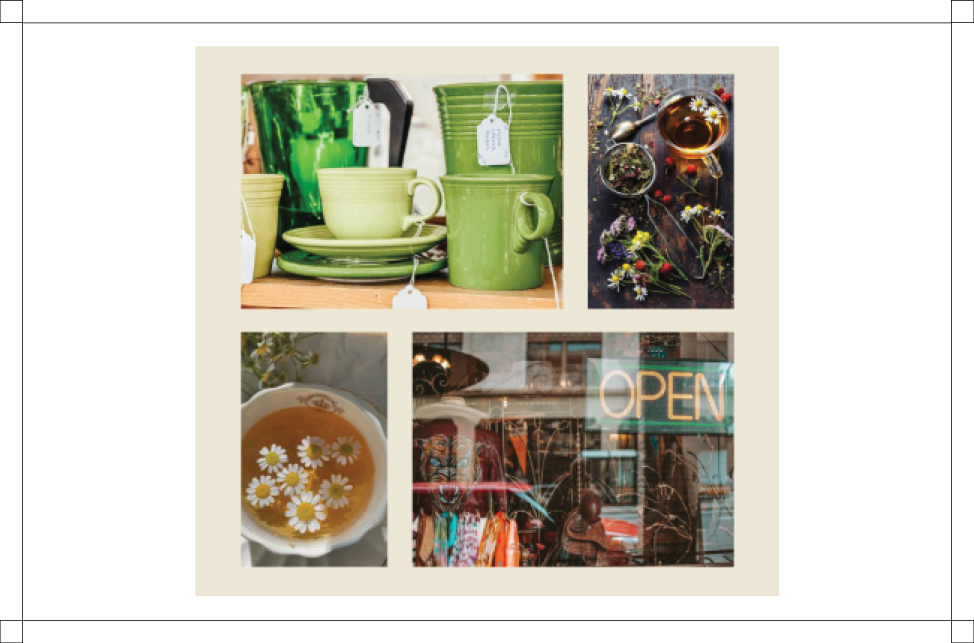
I began by immersing myself into the world of thrift, retro finds and friendly vintage vibe, browsing second-hand racks, noticing how colors lived together in older garments, and paying attention to the textures, signage and display systems that make thrift shopping feel communal and inviting.
The words “eclectic,” “trendy,” and “inviting” echoed strongly, and I recognized the opportunity to lean into rich olive greens, rusty terracotta, and warm beige tones (see palette below) to signal both vintage authenticity and modern polish.

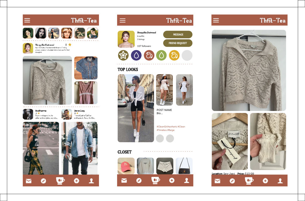
Clean and Clear
I preserved the brand’s playful personality within the badge system and color palette, while maintaining a clean, sophisticated layout for personal posts and other UX/UI pages. It was important to keep things clear, concise and easy to navigate.


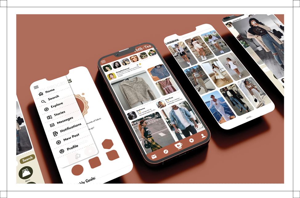
A Digital Thrift-stop
From start to finish, I developed a complete toolkit of brand assets: iconography, pattern systems inspired by thrift-textile textures, color-graded visuals, and stationery; all built to feel cohesive across multiple touchpoints. The system can flex for pop-up booths, in-store displays, social posts, and packaging, all while maintaining the same “eclectic trendy inviting” feeling.Reinforces cultural relevance while maintaining styalistic flair.
The result: a brand that feels curated but not precious, inclusive and stylish.