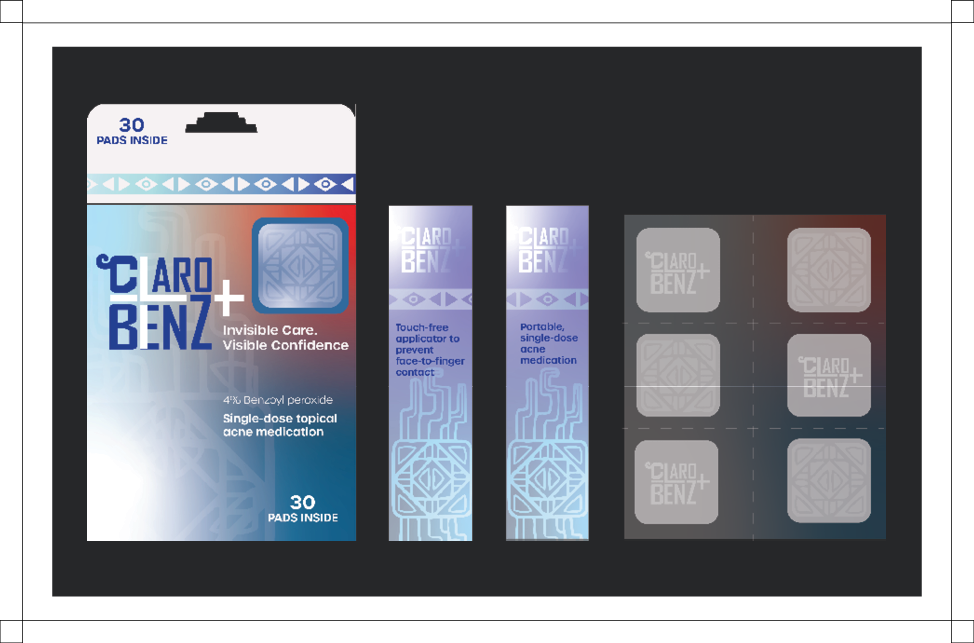
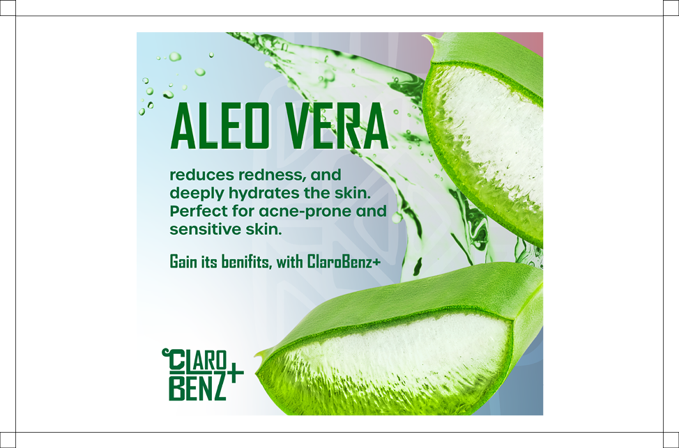
ClaroBenz+ is a topical acne treatment brand developed to resonate with Latino adults in their mid-20s to early 30s, a group disproportionately affected by adult acne. This single-dose, touch-free medication features 4% benzoyl peroxide and is designed for convenience, portability, and hygiene.
Customer Personas
Design Strategy
Social Media Campaign

Our People
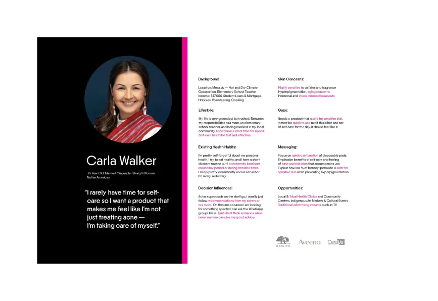
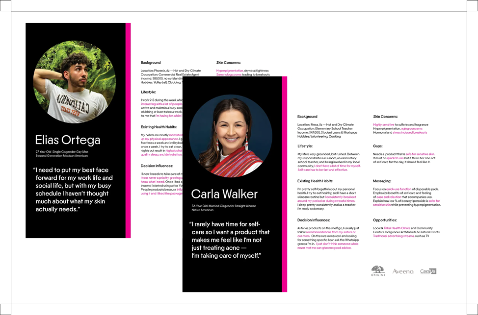
To ensure ClaroBenz+ spoke directly to its intended users, we developed customer personas grounded in cultural insight and skincare research. These personas represent Latino and multicultural adults in their mid-20s to early 30s who seek effective acne solutions without compromising on gentleness or convenience. Their stories guided every brand decision, from packaging structure to tone of voice, to create a product that feels made for them.
Packaging
Packaging that combines modern pharmaceutical aesthetics with visual elements from Aztec art. Clean, geometric forms, symbolic motifs and bold colors reflect clinical effectiveness and cultural impact.
Aztec Inspired Glyph Border - Reinforces cultural relevance while maintaining styalistic flair.
Gradient Color Scheme - Red transitioning to a cool blue, representing inflimation and irritation melting into clarity and confidence.
Touch-free Iconography - Applicator is made visible through the front window of the packaging, indicating its size, how its used, and its ease of transport.


Package
Packaging that combines modern pharmaceutical aesthetics with visual elements from Aztec art. Clean, geometric forms, symbolic motifs and bold colors reflect clinical effectiveness and cultural impact.
Aztec Inspired Glyph Border - Reinforces cultural relevance while maintaining styalistic flair.
Gradient Color Scheme - Red transitioning to a cool blue, representing inflimation and irritation melting into clarity and confidence.
Touch-free Iconography - Applicator is made visible through the front window of the packaging, indicating its size, how its used, and its ease of transport.